App Design in 3 steps - an appealing ui design for a better ux
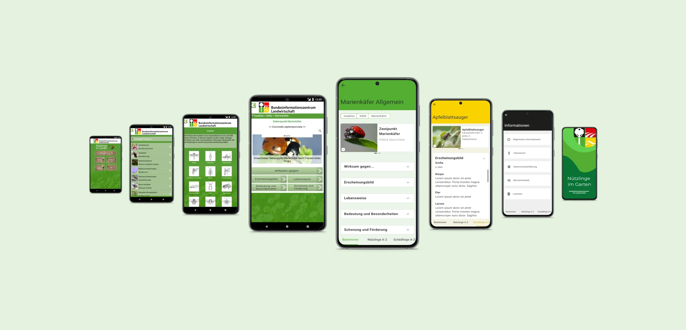
Mobile apps thrive on an appealing and well-structured design that helps users achieve their goals. In this article, I'll show you how an old app design can be redesigned to make it look modern and clean. You'll learn more about the design process and design decisions made to provide users with a user-centric UI and UX that helps them achieve their goals.

We all recommend things that help us solve upcoming tasks quickly and easily. This doesn't just apply to apps. For the design journey, I happened to choose the "Nützlinge im Garten" app, which is available for Android and iOS and hasn't been updated for a while, from the Bundesinformationszentrum für Landwirtschaft und Ernährung (Federal Agricultural Information Center). Since tastes change and trends also come and go, a visual update from time to time makes sense.
The article is divided into the following content areas, which should help you better follow the app design process.
- Analysis of the current state and preliminary design considerations
- Design improvements
- Clean up and realign content
Analysis of the current state and preliminary design considerations
The app provides information about living creatures such as insects and fungi. Everything that flies and crawls primarily in the garden or nature and can be used against pests is listed here. The group of pests can also be searched and identified. Let's go through the screens for an inventory before we start thinking about a new design.

The screens of the app illustrate two usage processes:
- How beneficial insects can be identified (Screen 1-3).
- How to search for beneficial insects via an A-Z register (Screen 4, 5).
I notice that the top app bar contains the logo and name of the app owner. This was common a few years ago, but is now outdated and will be the first thing to be adjusted. The green hue chosen for the background is one of the four brand colors from the logo of the Federal Agricultural Information Center and covers a flower meadow as an overlay, which can be seen hinted at in the lower area.
Do you need help with a design project?
At Cayas Software we love to provide some expertise with our experienced UI/UX designers.
Have a look at our design services
The home page
After the app has been loaded, this is the page that is displayed and serves as a menu to the individual functions. Next to the name of the app, buttons to the various functions of the app are offered. The buttons are designed with a wooden background to emphasize the nature-like theme along with the green background.
Listed are the action areas:
- "Identify beneficial insects"
- "Beneficial insects from A-Z"
- "Pests from A-Z"
- "Photo search beneficial insect"
- "Info".
Except for the photo search, we will take a closer look at all the sections in this article and adapt them to today's mobile app UI-UX design standards.

That not all areas belong to the main functions of the app is noticeable when you click through the individual areas. For example, the info button hides all the information about data protection, the imprint, accessibility and general information about the Federal Information Center for Agriculture and about the app. The question arises whether this prominent place is chosen correctly for this kind of information.
The text, as well as the additionally inserted icons and sketches, on the buttons is partly difficult to recognize because the contrast is too low to individual lighter areas of the background. Regarding the thematic content of the buttons, it can be said that three out of five buttons contain the keyword beneficial insects. This is where we can start and summarize a bit. Overall, the elements of the screen are placed far at the top and close to each other. This creates a lot of unused space at the bottom.
Determine beneficial organisms
The menu item "Determine beneficial organisms" offers the possibility to filter more precisely which type of beneficial organism it is via two buttons. If the category Fungi is selected, the selection of possible fungi species can be further refined in the next screen. If the Animals category is selected, as in the following screenshot, the search for animals can also be refined here by selecting the number of legs. For example, selecting "6 legs" for further identification will take you to a screen that shows only insects.

This raises the question whether this intermediate step is useful? Why not start directly with the selection of the insect species? In this screen, too, it is noticeable that the elements are arranged far to the upper edge and thus there is a lot of free space in the lower area.

Selecting the single option "Insects" lists 13 insect species of the classification system with drawings and names of the animals. These "buttons" can then be used to further refine the identification of the beneficial insect. The question I have is how often facts about insects are read so that it is justified that they need to be permanently and prominently displayed. According to common usability they should informations only be displayed when there is a need.
Beneficial insects from A-Z
The "beneficial insects from A-Z" button can be used to find beneficial insects by name using a search box. The result is presented alphabetically with pictures and names of beneficial insects. In terms of functionality and the information contained, the only thing that needs to be improved is the alignment.
If the beneficial insect is found, a detailed view opens with a large picture of the animal and further information. For some beneficial insects, such as the ladybug here, additional images can be displayed by swiping to the left and right. With the magnifying glass symbol the pictures can be enlarged. As already mentioned, the page offers further different information about the beneficial insects. Information on "Effective against", "Appearance", "Way of life", "Importance and special features" and "Protection and support" can be read.

The links to the individual pieces of information are arranged from top to bottom and are mainly located in the upper area. This in turn creates free space in the lower area, which is not used. With regard to the functionalities and the information presented, there are no necessary extensions at the current state. Visually, however, there is nothing to be said against a refresh.
Determine pests
The pest group is structured in the same way as the beneficial group. I will therefore spare us a detailed review. For the redesign, I will focus on the design of the Beneficial group and then apply the design to the Pests.
Now that we have analyzed all the views to be redesigned, let's start designing and answering the questions asked.
Design improvements
During the analysis of each view, we have already identified places that we can improve. For a consistent look and feel, I'll start with a color concept first. To do this, let's look at the logo and used colors which defines the corporate design of Federal Information Center for Agriculture.

According to the color symbolism green stands for nature, it looks rich and fresh, fits the garden theme and was already used as background color in the app. Yellow stands for sunlight, but is also a warning color. The red stands for love, but also for danger and black stands for the hidden and also for depth.
Now let's look at the different categories of the app.
- Determine beneficial insects
- Determine pests
- App information
For these three categories, I can appropriately use three colors from the logo. The beneficial insects get the green, the pests, the yellow and the information, the black. This way, everyone knows which functional area they are in at any point in the app.
Based on the previous design, I start to apply my color concept. To do this, the header displays the colors green, yellow or black in full saturation. As with the previous design, I chose a natural background photo with an overlay of each category color. In my opinion, this variation is too dominant. The background would distract too much from the content images and the respective information.

The focus can be moved from the background to the content area by keeping the body white and only highlighting the content elements in color. The color differentiation of the three different categories is still not sufficient for my taste in this variant.

Even with the third and last variant, the header remains in the corresponding colors green, yellow or black. The color for the body is derived from the respective color whose color value has been moved to a lighter area of the color space. This way, the elements can remain white and do not distract from the inserted images, i.e. the content. In addition, there is always enough contrast to the font.

I decided to go with variant three. With this one, the three different categories are made clear and the background keeps a low profile, while the content elements get the prominence they need.
You like how we approach things?
This blog is supposed to give you a little insight into our everyday business when we take care of design tasks – no matter if we build an app in a full-service-environment or just provide our expertise via EaaS.
Have a look at our design services
Clean up and realign content
Let's start with the home page again by looking at the title of the app, "Useful insects in the garden". The title of an app should not be displayed in the app bar. It used to be done that way. Today, the home screen displays the name of the app when it loads. This eliminates the need for naming within the screens. The design of the app should make it clear to the user at all times which app is currently open due to the recognition value.

The main function of this app is to identify beneficial insects and get information about them. In the old design, you can see that three of the five functional categories are about identifying or searching for beneficial insects. A little tidying and reorganization, and the home page shows the most important function of the app. Without any detours at all. Beneficial insects can be identified directly. Distinguishing between animal and fungus and searching for beneficial insects via photos is possible immediately after loading the app.

The other sections had to give way. Beneficial insects from A-Z and Pests from A-Z are now available at any time via the bottom tab bar, which is accessible from any screen. This new sorting and design bypasses unnecessary clicks and gets users to their destination faster. What remains at this point is the info button. This is because the various information about privacy, accessibility, etc. has no function in determining which beneficial insect are useful. This information has found its place in the app bar, behind an info icon.

In contrast to the old screen, the display of the different insect species is now a list. This offers the possibility that the information content is always in the same area and thus a uniform and orderly appearance is maintained. Longer names fit easily into the text field without having to reduce the font size.

Insect facts, which were always prominently displayed in the old design, are now hidden and can be made visible when needed. Because not every time facts are read through, which are already known and will not change or be updated.

If an insect order has been clicked, here in the example the chalcid wasps, the facts about this insect species can also be made visible if required by dragging the facts area downwards. I have chosen the same way to make the information area visible to the user. There is more space for the listing of the beneficial insects, because that is what it is mainly about.
Compared to the old design, the fields with the depicted beneficial insects are now higher and thus offer more space to the pictures of the animals, so that they are displayed larger and can be recognized better. There is now a space between the fields, which leads to the fact that the view is loosened up and the eye always finds a certain peace through the "white space" and has "air to breathe". If you select an animal, you will be taken to the detail page. Here in the example the ladybug.

Selecting an animal opens the details page for it. The photo of the ladybug, which is partially hidden by text and fields in the old design, remains clearly visible in the new design. The appearance of the header area with the picture and the name of the animal has been adapted to the design of the fields with the beneficial insects.

If more than one image of an animal is displayed, this is indicated by the indicator below the header area. The magnifying glass icon for enlarging the image is now located in the lower left corner of the image.
The page also displays five different pieces of information about the beneficial insects. "Effective Against," "Appearance," "Way of Life," "Importance and Special Characteristics," and "Protection and Support." All categories have been further separated from each other in the new design, so that the inserted white space also creates clarity here and the elements are no longer arranged in a confusing way. The introduction of visual hierarchies in the typeface, such as in the "Appearance" information area, ensures that the text is perceived as clear and structured.
Now you have made it this far, so we assume you gained some interest into our work. That is totally fine. Be our guest and give us some feedback or discuss a project of yours. We will be happy to hear from you.
Let's talk
As in the old design, I have also included the breadcrumbs again in the new design and deliberately emphasized them visually. Because especially in this information area there is a good learning effect, for example, when you have learned over time that lacewings are insects and belong to the order of the reticulated lacewings.
As I mentioned at the beginning, the structure and information content of beneficials and pests is the same. In order for users to see directly that they are in the pest area, the color yellow is used, as specified in the color concept.

Last but not least, only the general information category is missing. This includes everything about data protection, imprint, information about the app, etc. In the color concept I have provided black for this and applied after the same structure of the other areas.

If you are wondering why the red from the logo is not used, I can reassure you. In case of an error message, this color comes into play in the app. Otherwise, I decided against the red, because red is a warning color and is therefore usually associated with errors, problems or dangers. For some apps red can also be considered as a primary color, this is usually decided by the color concept based on the corporate identity.


Looking at the two variants, it is noticeable that it is not the background with its bold color scheme that comes to the fore, but the various contents. All the font colors used have sufficient contrast with the background and are therefore easy to read. The photos of the beneficiaries are displayed larger and in full size. The new design looks fresh, tidy and thus clear.
I hope I could give you an insight into my work. If you are also planning an app redesign and need support, just get in touch. Otherwise I am looking forward to seeing your app re-design.

Als UI/UX Designerin bin ich für alle Themen rund um Design und Nutzungserfahrung zuständig. Unsere Kunden unterstütze ich mit meinem Gespür für intuitive Nutzungsoberflächen und charmante Design- und Farbkonzepte. In meinen Blogs werde ich Einblicke in meine Arbeit geben, über UI/UX Themen sprechen und Designtrends unter die Lupe nehmen.
Ich arbeite derzeit an der Portierung einer Xamarin Forms App zu .NET MAUI. Die App verwendet auch Karten von Apple oder Google Maps, um Standorte anzuzeigen. Obwohl es bis zur Veröffentlichung von .NET 7 keine offizielle Unterstützung in MAUI gab, möchte ich Ihnen eine Möglichkeit zeigen, Karten über einen benutzerdefinierten Handler anzuzeigen.
In the world of digital design, terms such as UX design, UI design and usability play a crucial role. But what exactly do these terms mean? How do they together contribute to designing digital products in such a way that they are not only beautiful to look at, but also offer a smooth and satisfying user experience? In this blog article, I would like to differentiate between the terms and show how they interact.
Whenever people encounter barriers, whether due to disability, age or situation, they are denied full participation in society and a self-determined life. The goal of digital accessibility is to enable all people to understand and interact with user interfaces without assistance. In this article, I would like to explain which areas of accessibility need to be considered in order to come a big step closer to the goal of a website that is understandable and usable for all people.


